I had many issues with my website builder at first as I had no idea how to use Wix. However, with guidance, I managed to set up a full website at https://cbtaylor1238.wixsite.com/charlotte and received feedback that it looked very professional.
I ensured that my tagline and title were reflected in my choice of photo. My website needed to hook the audience in from the first look, so I took some footage of the full moon near my street. Upon feedback from Mrs Mann, I chose to use this footage as the first look as I felt that it perfectly encapsulated the balance between normality and the paranormal that my trailers address.
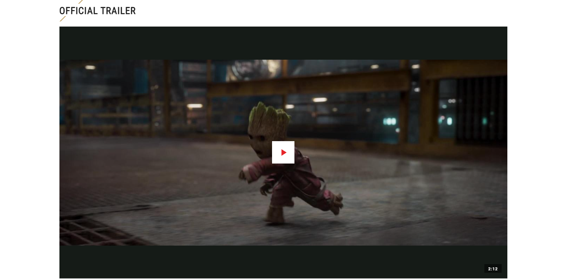
Next I needed to make sure that visitors to my website would be able to see the trailers so that they could see a hint of what the film will offer. A lot of found footage films rely heavily on trailers to hook the audience as the genre is quite niche. At first I had problems with putting the trailers on the website, but by using a host platform like YouTube, I was able to link directly from the website to the trailers.
I decided to include the release date with a brief synopsis as otherwise the audience wouldn't be able to know when they could watch the film. This date in history holds significance as the ghost in our trailers, Charlotte, died on this day over a century ago.
I needed to build trust with the audience so that they would be assured that the film was award winning, so I included some reviews of the film.
Lastly, on the homepage, I included the links to our social media as our demographic was the younger generation, who use social media. This contact form allows for interested audience to get in touch directly with us, if they want anymore information about our film.
I included a synopsis again on its own page for ease of use.
It is important for the audience to form attachments to the characters, especially in horror when characters meet ill fates. Therefore, I included a cast page with pictures of the actors as well as their resumes, to build attachment with the audience. At first the images I used were very blurry, so upon feedback, I changed the photo, sometimes emailing the cast for personal photos to ensure the photos were similar.
I also included a gallery, which includes the social media posts, for a cohesive hint at the story. The trailers also feature on this page and their own page for the audience's ease of access.
Lastly, after speaking to our focus group, I decided that a reviews and accolades page would be appropriate. I used feedback I had received from past cast members and acquaintances to build another level of trust with the audience.
WEBSITE ONE: ANNABELLE COMES HOME
The themes and imagery from the film are found across the whole promotional package, so the website shares them with the poster. The red and black colour scheme allows the audience to still be immersed in the Conjuring Universe, which allows the continuation of the mystery around the Annabelle doll. This also allows the audience to make the distinction between the film Annabelle doll and the real life Annabelle doll, on which this movie series is based. The first banner on the website uses the same poster image as a thumbnail for the trailer, keeping a sense of continuity.
Also, on the top banner of the Annabelle website, there are clear convergent links. (Convergence is the interconnection between media, technology and communication, which often relies on digital technology). This convergent hub ensures the promotion of the film through related movies, tv shows, games news and merchandise, linked clearly for the audience's easy access. Through these links, the audience extend their communication with the brand. Lower down on Annabelle's website, there are also links to the Warner Brother's shop, as well as a multitude of social media platforms, with sites like Facebook and Twitter targeting a secondary demographic of an older audience, as well as the main target audience, through Instagram, Snapchat and Youtube.

Next, the website immediately alerts the viewer to where the movie can be seen. This is extremely important placement as the viewer may not have a long attention span, so once they’ve watched the trailer, the movie may be immediately bought. The first option is to buy the film on a digital service. This shows that the distribution team knows the demographic for the film extremely well as the majority of the audience are younger and more likely to watch online. However, there is still an option to buy it on dvd, which shows Warner Brothers is still aware of the audience that cannot access online content.

Next, the website contains a gallery of photos from the film, most appearing in the trailer too. This allows for an audience to feel they are accessing bonus content, and for viewers to share stills around fans to share the movie before it’s release. Sometimes, galleries may have behind the scenes photos included which also helps the audience feel more included in the process of making the film, especially in films that use a lot of cgi, like Annabelle.
Warner Brothers also usually release a few clips to ensure excitement remains in the wait for the film to be released. They are not essential to the website as the main trailer is already showcased above. However, for fans who scroll right down, they will be able to watch sneak peeks of the film if they cannot wait until the release of the main film.
WEBSITE TWO: GUARDIANS OF THE GALAXY VOL 2
On Marvel’s website, they need to have pages for each of the films contained within the Marvel Cinematic Universe. The logo is very bold to ensure that fans know they’re on the right page. As well, Marvel has chosen a black background, allowing the logo to stand out well. Next to the logo, a black and white picture of the cast taken during the promotion for the movie stands out and makes the page more aesthetically pleasing to the audience. Marvel also includes easy access for both buying the film on dvd and streaming it on their own digital service Disney+ ( with another use of a convergent link), catering to all ages within the target audience. Convergent links across the header link to videos, characters, comics, movies, news and games. This means that Guardians of the Galaxy also is selling other Marvel films such as Black Widow, Spiderman and Avengers.

As well as the usual website features, Marvel takes the opportunity to promote other content the target audience may like. These allow for easy access to the content, and Marvel has been clever to link the films preceding and succeeding the film in the Marvel Cinematic Universe.
Marvel then has created character profiles for fan favourites returning in Guardians of the Galaxy Vol 2. Fans may have forgotten facts about their favourite characters and this is a perfect way to keep the audience engaged on the website and feel catered for by Marvel. This also ensures people will visit the site several times, and allow the audience to feel that Marvel provides them with enough details on the run up to the movie release.
Lastly, Guardians of the Galaxy as a series has pride in its soundtrack, as the walkman prop feeds directly into the plot of the movie, so the soundtrack tells the story alongside the plot. Marvel has provided a spotify playlist of songs used, and this was released ahead of the movie release to make the audience feel included in the post production element, and have a guess of the plot for the sequel. Marvel is also very aware of their target audience as their demographic is the same as Spotify’s average user demographic. This is also an example of institutional synergy as it is a clickthrough to buying the soundtrack. Therefore the soundtrack sells the film and the film sells the soundtrack. Cross media convergence and synergy are crucially important to Disney.
WEBSITE THREE: JOKER
The Joker's website cleverly opens a pop up window with the trailer the second the website is opened. This takes into account the viewers who come to the website to find out more about the film, or those who have only heard of the title and are looking for the trailer. This also is handy as viewers can return to the website and immediately watch the trailer as many times as they want.

Next, once viewers click off the trailer popup, the image shown is that of the movie still, which became a meme when the trailer came out. Warner Brothers clearly were aware of the viral meme created and used it in the subsequent marketing campaign as their target demographic were most likely to find the film through social media platform where the meme went viral. In addition to this, the website itself is formatted differently to other websites. Instead of scrolling down, viewers can access different content through pages tabbed in a header. This makes for a very easy online experience for viewers as all the content can be viewed in one page, allowing for a feeling of inclusiveness. Next to the still, Warner Brothers also highlight the main talent and director, Joaquin Phoenix and Todd Phillips so that viewers can easily find similar films by the same team. The logo works within the promotional package as the same font is used across the marketing campaign. This first page also tells the viewers where to watch the film- only in cinemas, and now on dvd as can be seen linked below in the Warner Brothers shop.

The next page is a gallery of videos. This is clearly marked videos so that viewers can immediately find the trailers without needing to scroll through large amounts of text to find them. Each trailer also clearly shows Joaquin Phoenix in the thumbnail as he is a Unique Selling Point for the film as the star talent. In the banner above, Warner Brothers also clearly link social media platforms and the hashtag #JokerMovie. This also shows Warner Brothers are acutely aware of the target audience as they link Facebook and Twitter for the older DC comic audience as well as Instagram for the younger DC film audience. The hashtag also shows the online presence for the Joker is large as marketing strategies can exploit the virality of hashtags to reach a wider demographic of people as well as new audiences.
Lastly, the banner has a tab for synopsis. Usually synopsis' are not put on the website as viewers can work out the synopsis from either a source material, or the trailers and photos put onto a website. However, this shows Warner Brothers are catering to viewers who may not have known anything about the movie or source material before coming onto the website. As well as a short summary of the movie, they also recognise the star talents previous works as well as any awards received. The same treatment is given to the directors and production company. The scrolling bar also means that the content stays on one page and the viewer can decide to only read a section of it. The white text stands out on a mostly black background but for those fans who enjoy easter egg type discoveries, the movie still from the first tab is lightly placed underneath the scrolling text.


ANNABELLE COMES HOME: the website is a good example of how Warner uses convergent links to promote the brand and extend the audience's communication with the film.
ReplyDeleteGUARDIANS OF THE GALAXY VOL 2: good understanding of how Disney uses synergy and convergence on the Guardians website.
TO ALL THE BOYS I'VE LOVED BEFORE: This isn’t a conventional website as it is a Netflix product. Netflix is a good example of a completely different marketing model.
Your research has been thorough and well presented. You explain the process behind your website design. Your website for ‘Charlotte’ functions smoothly and hosts the main and teaser trailers, synopsis, gallery of photos, additional video footage, social media links for Twitter and Instagram, and reviews / accolades. It would have benefited from the addition of the film poster and a list of film festivals / screenings as well as more awareness of brand cohesiveness, such as matching the title font of the poster and the title on the home page. As you observe in one of your posts, your social media posts needed more content. The home page offers the title (the release date is elsewhere), tagline and dark colours which frame a short video loop of an urban street scene at by moonlight, with a clock face. You had to be inventive during lockdown in order to capture what video footage you could and you have made good use of this to signal the thriller / ghost genre. It is easy to navigate around your website and you have punctuated sections effectively, such as with a pull quote from Mark Kermode. The cast page is nicely presented with photos and bios.
ReplyDelete